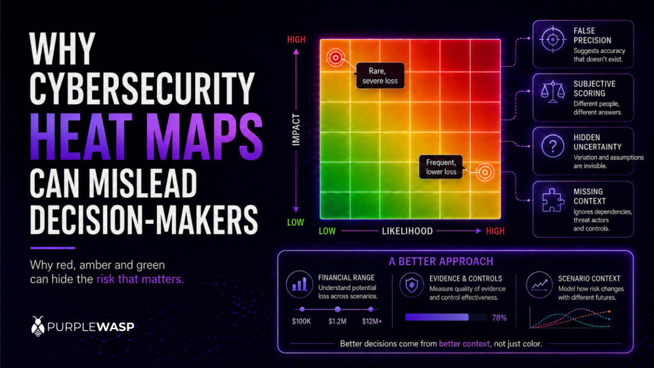
Walk into almost any security steering committee and you’ll see the same slide: a grid of red, amber, and green squares, arranged by likelihood and impact, with a scattering of risks plotted across it. It’s the most common visual in cybersecurity reporting, and it’s also one of the most quietly misleading.
Heat maps aren’t wrong so much as they’re incomplete in ways that don’t announce themselves. They look precise. They look like they’ve done the analytical work for you. Neither is usually true, and that gap between how confident a heat map looks and how much genuine analysis sits behind it is exactly where bad decisions get made.
The Appearance of Precision
A risk might be assigned a likelihood score of four and an impact score of five. Multiply the two and you get twenty, a number that looks mathematically meaningful.
But what does a likelihood score of four actually represent? A 40% chance within the next year? A 70% chance? Does it reflect industry data, internal incident history, threat intelligence, or simply the judgement of whoever filled in the form? The same question applies to impact. A score of five might mean over a million pounds in losses, a major regulatory investigation, days of operational disruption, or serious reputational damage. Those consequences aren’t interchangeable, yet they routinely get compressed into the same category.
The arithmetic is exact. The inputs behind it usually aren’t. Multiplying two subjective rankings doesn’t turn them into an objective measurement, it just dresses a judgement call up as a number.
Ordinal Scores Are Not Quantities
Most heat maps use ordinal scales: rare, unlikely, possible, likely, almost certain. An ordinal scale tells you one category is worse than another, not by how much. The gap between “minor” and “moderate” might be small, while the gap between “major” and “severe” might involve tens of millions of pounds, yet a conventional five-point scale treats every step as if it were evenly spaced.
This gets worse once likelihood and impact are multiplied together. A risk scored likelihood five, impact two produces the same total as one scored likelihood two, impact five. Both land on ten, but they describe very different situations, a frequent, manageable disruption on one hand, and an unlikely but potentially catastrophic event on the other. Those risks shouldn’t automatically get the same treatment just because they occupy the same spot on a matrix.
Risks in the Same Square Aren’t Always Comparable
Consider two scenarios. A phishing campaign causes periodic account compromise, several incidents a year, but strong monitoring keeps the average loss modest. A ransomware attack hits a critical operational environment, less likely, but capable of prolonged disruption, regulatory consequences, and substantial financial loss if it happens.
A heat map may place both in the same red category. That tells decision-makers both matter. It doesn’t tell them which creates the greater expected loss, which has the greater potential for an extreme outcome, which is worsening fastest, or which should get the next unit of investment. The colour creates a category, not a decision.
Averages Hide the Tail
Impact scores are usually based on a “reasonable” or “most likely” loss, which conceals the smaller number of events that produce far worse outcomes. A data breach might cost between £200,000 and £500,000 in most cases, but exceed £10 million under the wrong conditions. A single impact score can’t show the difference between the most likely loss, the average expected loss, a severe but plausible loss, and the worst credible outcome.
For decisions about insurance, resilience investment, or capital allocation, that distinction is the whole point. Two risks with similar average losses can have wildly different extreme-loss potential, and a heat map compresses both into the same box.
Scoring Is Rarely Consistent
Heat maps depend on everyone applying the scale the same way. In practice, they usually don’t. One team reserves a likelihood score of five for something expected several times a year; another uses five for anything more likely than not. A control owner may score a risk lower because they trust their own controls. An auditor may score the same risk higher because the evidence behind those controls is incomplete. A project team under delivery pressure may quietly underestimate an impact score because a higher one would slow the project down.
None of this is necessarily dishonest, it’s just how subjective judgement behaves under real incentives. But when inconsistent judgements from different people land on the same matrix, the visual implies a comparability that was never actually there.
Static Maps Struggle With Dynamic Risk
Cyber risk changes constantly. A newly disclosed vulnerability raises the likelihood of compromise overnight. A control fails. A supplier incident reveals a concentration of third-party exposure nobody had mapped. Heat maps, meanwhile, tend to get refreshed quarterly or annually.
The result is a static picture of a moving target. A risk marked amber may have been assessed before a system became internet-facing, before a critical control failed, or before active exploitation began. Unless the underlying scenarios get updated alongside events, the map quietly becomes a historical artefact that still looks like a current decision tool.
They Don’t Show Risk Concentration
Risks are rarely independent of each other. Several scenarios might all depend on the same identity platform, cloud provider, or a recovery process that’s never actually been tested under real conditions. A traditional heat map plots each risk as its own isolated point, so it can’t show that ten separate amber risks all collapse into a single shared failure point.
The same problem applies to smaller gaps combining into something bigger. Weak access management, incomplete logging, slow incident response, and poor asset visibility might each look manageable individually. Together, they can form a credible path to a major breach. A decision-maker reviewing risks one square at a time is unlikely to notice that systemic exposure at all.
The Matrix Invites the Wrong Conversation
When a heat map goes in front of senior leadership, the discussion often narrows to the scoring itself: why is this red rather than amber, can the likelihood move from four to three, which risks shifted since last quarter, how many red items are left. None of that is entirely unhelpful, but it crowds out the questions that actually matter: what could happen, which business services would be hit, how much loss is realistically on the table, which controls matter most, how effective are they really, and is the remaining exposure something the organisation should accept, transfer, or keep working on.
A strong risk discussion centres on scenarios, evidence, and trade-offs. A weak one centres on the colour of a cell.
Why Heat Maps Persist Anyway
None of this means heat maps are useless. Cyber risk is genuinely complex, and boards can’t review every vulnerability, control test, and technical dependency directly. They need a summary that helps them direct attention and ask better questions, and a heat map offers a familiar format, a quick overview, and a simple way to flag what needs discussion.
The problem isn’t the tool. It’s asking the tool to do more than it can. A heat map can be a reasonable starting point for rough triage. It shouldn’t be the final word for anything material enough to drive real spending or a genuine risk-acceptance decision.
A More Defensible Approach
Define scenarios clearly. “Ransomware risk” is too broad to score meaningfully. “A threat actor compromises privileged credentials, encrypts a critical service, and disrupts operations for a defined period, with financial, legal, and customer consequences” gives you something you can actually assess and compare.
Use ranges instead of single labels. Where the risk is material, express likelihood and impact as ranges rather than points: expected frequency, most likely loss, a severe but plausible loss, expected downtime, records affected. Frameworks like FAIR exist specifically to support this kind of estimation, producing numbers that can be compared and defended rather than colours that merely look ranked.
Separate the types of impact. Financial loss, regulatory consequence, operational disruption, and reputational damage don’t belong in one blended category. Showing them separately makes clear why a risk matters and who should actually be in the room deciding what to do about it.
Show the quality of the evidence, not just the score. A red risk backed by tested controls and solid incident history is a different situation from a red risk built mostly on assumption. Both may need action, but not necessarily the same action, and a decision-maker should be able to tell the difference at a glance.
Tie residual risk to actual control performance. Residual risk should reflect controls that have been tested, not controls that are simply believed to work. If nobody’s verified it recently, that’s worth saying explicitly rather than folding into a reassuring green square.
Surface dependencies and trends. A useful risk view shows whether exposure is rising or falling, what changed since the last review, and which risks quietly share the same underlying dependency, so leadership can spot systemic exposure instead of reviewing everything as if it existed in isolation.
Connect every material risk to an actual decision. Mitigate, transfer, avoid, or formally accept, with an owner, a target date, and an expected reduction in exposure attached. The real question was never whether the square is red. It’s whether the organisation is making a proportionate, informed decision about what’s inside it.
Frequently Asked Questions
Are cybersecurity heat maps always wrong? Not wrong, exactly, but limited. They’re reasonable for a quick, rough triage of a long list of findings. The risk is treating that rough triage as if it were a rigorous, defensible basis for major spending or risk-acceptance decisions.
Why shouldn’t you multiply likelihood and impact scores together? Because those scores are ordinal labels, not real measurements. Multiplying “high” by “medium” produces a number that looks mathematically meaningful but doesn’t correspond to any actual probability or financial value. It creates an illusion of precision the underlying data doesn’t support.
What should organisations use instead of a heat map? For risks material enough to drive real decisions, a quantitative approach like FAIR, expressing likelihood and impact as financial ranges, gives leadership something they can actually compare and defend. Heat maps can still work as an initial sorting step, as long as they’re not treated as the final analysis.
Why do different people rate the same risk differently on a heat map? Because most heat maps rely on vague, subjective labels like “high” or “medium” without a shared, explicit definition of what those terms mean in concrete, measurable terms. Without that shared definition, the rating reflects the individual assessor’s judgement, and sometimes their incentives, as much as the actual risk.
The Bottom Line
Cybersecurity heat maps are attractive because they make risk look simple. Cyber risk isn’t simple, and reducing it to red, amber, and green can hide uncertainty, exaggerate precision, obscure severe outcomes, and pull attention toward whichever square looks most alarming in the room rather than whichever risk would actually cost the most if left unaddressed.
A heat map can help leaders see where to look. It can’t, by itself, tell them what to do. The goal was never to move dots around a matrix. It’s to understand what could actually happen, decide what matters most, and take action that produces a real reduction in risk.